Making use of Open Data with Business Intelligence in ArcGIS Insights gives a new view on existing data. ArcGIS Insights is analysis software that fuses location analytics with open data science and business intelligence workflows. Answer questions you didn’t know to ask, analyze data completely, and unlock new insights. Powerful analysis made simple. Explore data and perform advanced analytics such as spatial, statistical, predictive, and link analysis within an intuitive experience that works the way you do. Revolutionize decision-making with analysis that visually informs the organization of new, previously unexplored insights gained from the perspective of “where”.
Thanks to our intern Amelie we can present an analysis that has been carried out using open-data available from Mobigis and Statbel using ArcGIS Insights platform for analysis and visualisation. She transformed complex datasets into manageable questions. She used exploratory analysis techniques to quickly uncover patterns, trends, correlations, and relationships.
Road Safety – link information
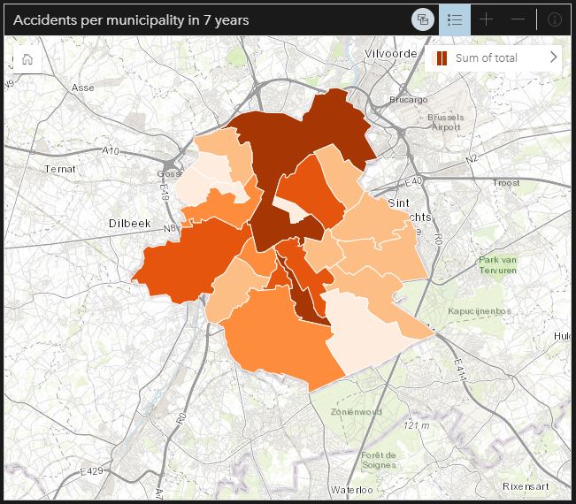
The project of Amelie started with bringing together trafic data and school information into ArcGIS Insights.
Thanks to ArcGIS Insights you can directly connect to your data and put your data onto a page by performing a drag-and-drop operation.
The next step was visualization of the data on cards as maps, charts, and tables to unlock endless possibilities for analysis and data exploration.

Find anwers in your data

ArcGIS Insights lets you analyze data with ease. Answer questions that guide you to the best tool or dive right into analysis. Quickly aggregate data on a map; reveal hot spots and outliers; make predictions; join data spatially; show relationships between people, places, and events; and more.
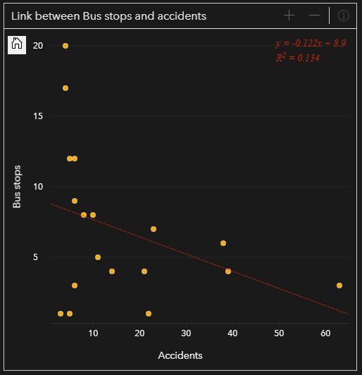
Amelie discovered a correlation between the number of bus stops on 1 place and the number of accidents and also a correlation between the number of tram stops and the number of incidents.
Further investigation into these trends are necessary if you would like to know if there is a link with the infrastructure. Maybe there are less accidents where there are multiple busstops because their is one infrastructure where all busses come together instead that a person needs to cross roads to step over to another bus where there are less busstops.
Discover more correlations in the ArcGIS Storymap that is made by Amelie where she also looks into the people involved, age groups, pedestrians and the hours when these accidents happen and which schools are more vulnerable to accidents.
Show the results
You can transform your analysis into interactive data stories. Create reports that use text, links, images, videos, and branding to clearly communicate your results and show how you reached them. Publish reports internally or publicly to keep stakeholders informed, helping you gain support and buy-in.
Amelie used ArcGIS Storymap to tell more about her project.

